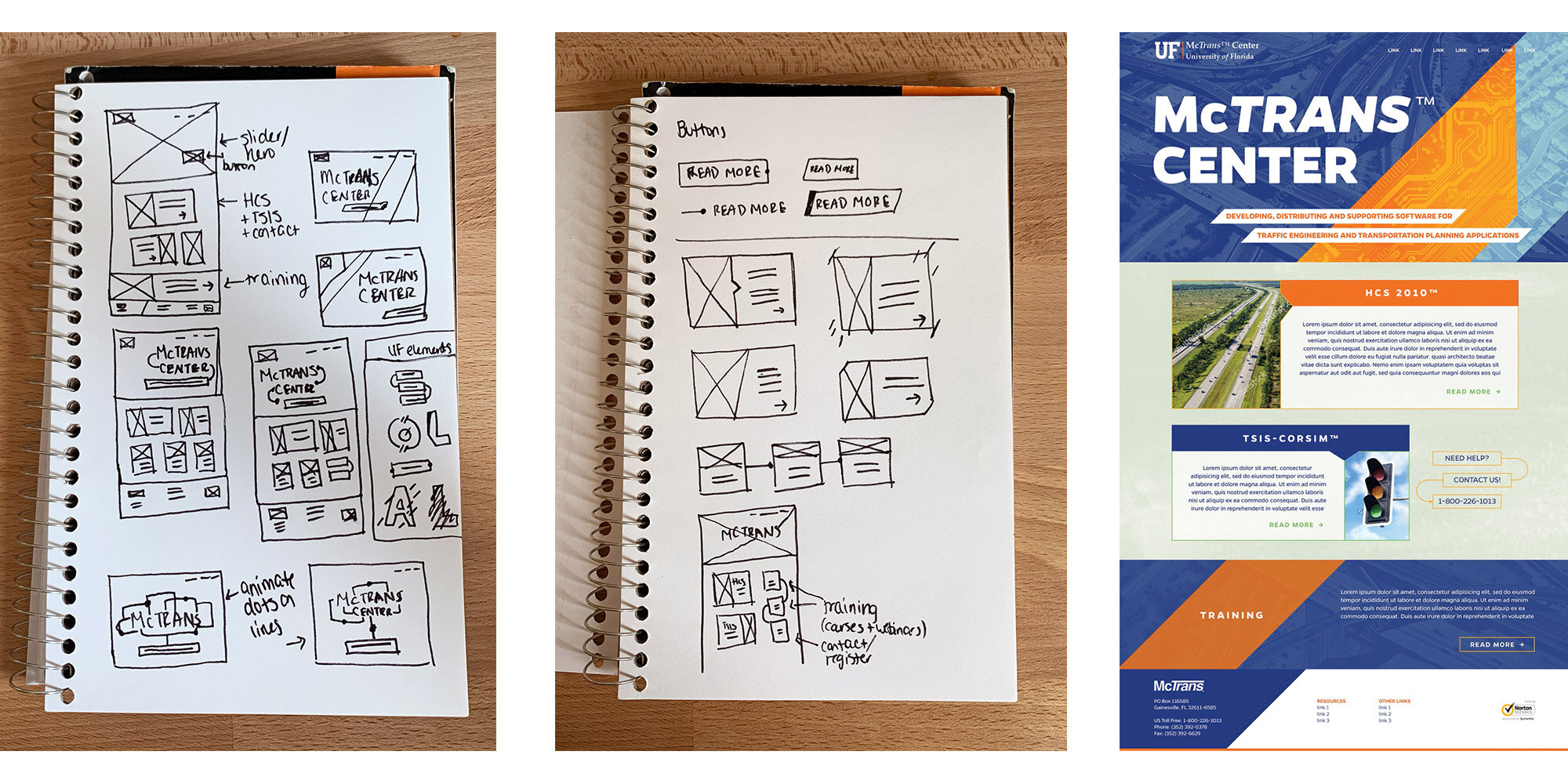
marionne patel

The McTrans Center

The University of Florida's McTrans Center develops transportation software and also trains traffic engineering professionals to use their products. They needed to revamp their website in light of the university's rebranding and their upcoming release of a new software program. I designed and built a website that gives them a distinctive look within UF's brand identity guidelines.

McTransSite-header.png


The animated hero image on the homepage quickly and visually communicates the center's purpose. After seeing the animation, a co-worker’s kid mentioned that the moving dots looked like cars. This is one of my favorite pieces of feedback because it illustrates how the simple, abstract animation easily conveys the idea of transportation, especially when paired with the background image.

mctrans-early-iterations.jpg

Wireframes and an alternate mockup play around with other ways of integrating UF’s new brand elements. The alternate mockup shows a collage of three different images, each using a different UF duotone. If you look closely, some of the roads from the blue images connect with components of the orange microchip image. The particular way that the images fit together would have made it more difficult to create different variations of this collage for other marketing materials.

mctrans-responsive-alldevices.jpg

The final design incorporates UF's use of boxed text and curved lines to create something a little different for the McTrans Center's look brand. It also use gritty border edges sparingly to contrast with the clean lines and boxed areas.


with Liquid Creative